Premier League Kits 2018-19: Man Utd, Arsenal, Chelsea, Liverpool...
autty 2018-05-29 21:15:02 评论
Keeping on top of all the new Premier League kits released throughout the summer is not as easy as it used to be.
Long gone is the era when teams only had two strips and even the home kit lasted two seasons.
Now you can expect around three new kits every summer and they add up stretched across 20 teams. So keep track with them all as they are released with our guide and verdict on all the designs coming to a Premier League ground near you soon...
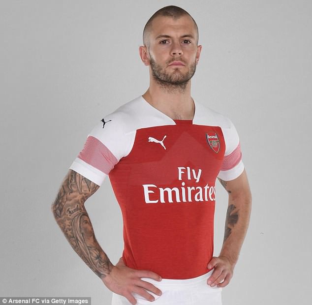
Arsenal kits 2018-19
Home kit
It's a new era at Arsenal and while they hope for success under new manager Unai Emery, Arsene Wenger's replacement cannot be at fault for its messy looking start.
Arsenal's first home strip under the Emery has, at best, received mixed reaction from Gunners supporters and it is easy to see why.
You arguably have to go back nearly 25 years for the last time Arsenal featured as much white on the shoulders and sleeves combined.
Done correctly it should not have been a problem but the thin red stripes on the sleeves do nothing to compliment the design. Should the good times come rolling back it may become a cult classic, otherwise this one won't be fondly remembered.
HOME KIT VERDICT: 5/10

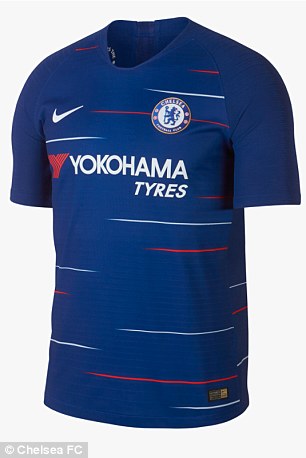
Chelsea kits 2018-19
Home kit
It's not very often you see a splash of design on a Chelsea strip, but maybe Nike have found just the right balance for the 2018-19 season.
The Blues' new home kit maintains the key details - blue shirts and shorts with white socks - but it's the invasion of the trim colours on the front of the strip that raises the eyebrows.
The subtle but certainly noticeable white and red stripes that flash across the front and reverse of the kit certainly mark a departure from safe and simple in the design stakes.
Red may have last featured on a strip as recent as 2016 but it doesn't happen too often these days. Fans are divided but at the very least it blends in well with the sponsor logo...
HOME KIT VERDICT: 8/10


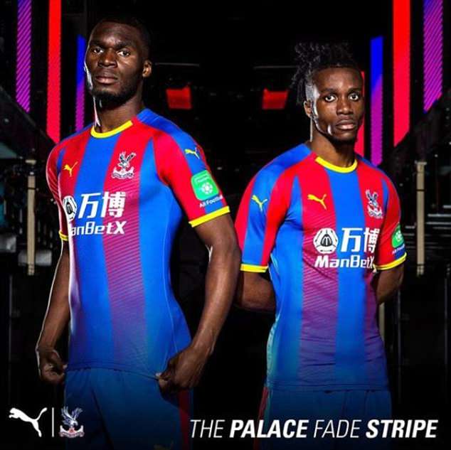
Crystal Palace kits 2018-19
Home kit
Crystal Palace are more liberal than most teams that feature two predominant colours when it comes to mixing up their home kit, and 2018-19 will prove another change of direction.
Stripes remain, and of course they are red and blue, but the cut of them is thicker. In addition the red stripe will gradually fade to blue going down the shirt.
Yellow trim helps compliment the finish, with Puma's first kit for the club proving innovative and it has been well received by fans. It's just a shame about the ugly sponsor.
HOME KIT VERDICT: 8/10
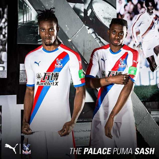
Away kit
Not only have Puma pleased Palace supporters with their home kit but they have done the double with a classy away design too.
For a certain generation it may as well be the home kit, as Palace played at Selhurst Park in white strip with a red and blue sash from the mid 1970s for nearly a decade.
There was no need to make stylistic changes like with the home shirt and as a result the Eagles have two excellent strips for the new campaign.
AWAY KIT VERDICT: 8/10
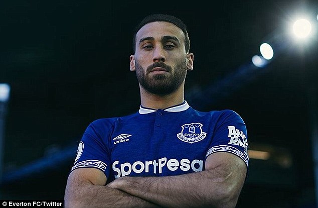
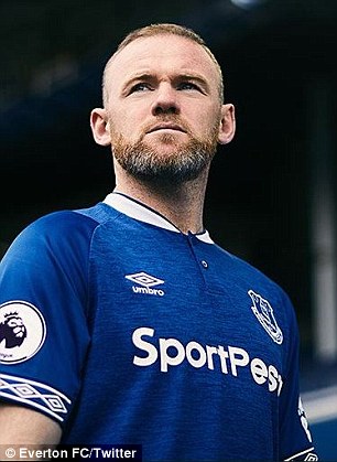
Everton kits 2018-19
Home Kit
Not much went right for Everton over the 2017-18 campaign but there is hope for the Toffees that brighter days lie ahead in the new season.
For a start, supporters are sure to be delighted with their new home strip. But then considering it was made as a result of a fan consultation it is hardly a surprise.
Umbro collaborated with fans to understand their preferences on colour, collar and other design features.
As good as the finished article looks, it is odd to see the diamond Umbro template make a return to the sleeves. It was last seen on a strip that was worn when Everton were incredibly fortunate not to be relegated in 1998.
HOME KIT VERDICT: 8/10
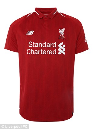
Liverpool kits 2018-19
Home Kit
There are not too many ways you can change an-all red kit but in a world where the commercial arm of football clubs demand at least two new strips to sell every year, Liverpool seem to year-on-year get the balance right.
No shocks once more with the home strip. It's red, albeit judging by the promotional pictures a slightly darker shade than usual. Trim remains white along with the club badge that featured in yellow for the 2017-18 campaign.
A stylish buttoned collar is a welcome addition and back for the first time in five years. No thrills stuff but no complaints either.
HOME KIT VERDICT: 8/10

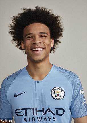
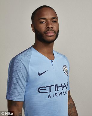
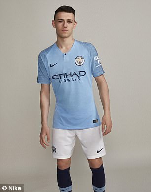
Manchester City kits 2018-19
Home kit
Believe it or not there is almost always a change to the predominant colours in a Manchester City kit and this summer's is no different.
It comes in the socks which will switch from light blue to navy - in homage to the double promotion winning seasons and to return to the Premier League in 2000 and the club's first top flight title in 1937.
City fans will not want to be reminded that on both occasions, relegation followed a year later.
Not that we are suggesting Pep Guardiola's side are going down next season. There is more chance of City fans embracing the Champions League anthem and singing along with high acclaim for UEFA.
This is a well designed strip though from the slightly darker trim on the arms to the added button on the neck. City are not only the team to beat on the pitch but in the fashion stakes too.
HOME KIT VERDICT: 9/10


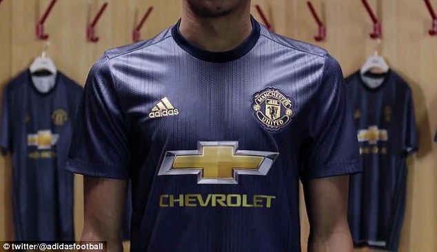
Manchester United kits 2018-19
Third kit
Manchester United are a club steeped in history and tradition and they've honoured that with the unveiling of one of their new strips for next season.
The Red Devils will go back to blue for the 2018-19 campaign when they wear their third kit with a design inspired by the 50th anniversary of the club's historic first European Cup win.
The Red Devils wore blue in their defeat of Benfica to become the first English side to win European football's biggest club prize.
The gold trim is a stylish touch and as a bonus blends with the sponsor logo. United often produce strong change strips and this is another of those.
THIRD KIT VERDICT: 9/10

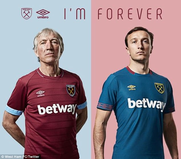
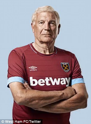
West Ham United kits 2018-19
Home and away kits
The template for a West Ham kit was easy to follow for Umbro. Mainly claret but with plenty of blue too.
Where in that memo it got altered to just plain claret shirt with a touch of blue trim is anyone's guess.
Admittedly it is aesthetically not too bad - a little bland - and what perhaps saves Umbro is that West Ham have played in kits in the past with only a touch of blue - albeit rarely.
The navy blue away strip although a similar design comes across a lot more acceptable... until you see the yellow socks.
HOME KIT VERDICT: 7/10
AWAY KIT VERDICT: 6/10
- 消息参考来源: DAILYMAIL
- 严禁商业机构或公司转载,违者必究;球迷转载请注明来源“懂球帝”
- 懂球帝社区规范:抵制辱骂

